 One of the most challenging—and beautiful—achievements in U.S. postage stamp artwork is the “50 State Bird and Flower” stamps issued in 1982. The imagery is exquisite, with each stamp deftly composed and different from every other. Each bird/flower combination has a naturalness of appearance that seems inevitable. And each is beautifully silhouetted with white space.
What makes these stamps unusual is that they were the first  U.S. stamps created by a Father and Son artist team: Arthur (1917-1990) and Alan (1950- ) Singer.
There were creative challenges. Each stamp had to be distinctly different, not to mention visually appealing, and yet several states had the same state bird. For example, the Cardinal would appear on seven stamps, and the Western Meadowlark on six. As for state flowers, the Apple Blossom and Magnolia appear twice and the violet three times.  And yet looking at the sheet of 50 stamps, those multiple renderings of bird or flower aren’t noticed because each presentation is unique.
Father and son were up to the challenge. Arthur was a noted avian illustrator having published Birds of the World and Guide to the Birds of North America. In his words, “There are many illustrators who are only concerned about portraying birds—or other animals—accurately. While this is, of course, very important, I try to make my work  artistically good as well as accurate.”
It was Arthur’s practice to begin work in the early morning in his Jericho, New York, studio and continue to late at night. Father and son worked together on separate drawing tables. Arthur would position the bird on his art board and indicate to son Alan the approximate position of the flower. Alan would then sketch the flower art on the board. Father and son first made rough sketches of their subjects  and then proceeded to greater detail, at times using pastels for color. When they deemed their sketches satisfactory, the drawings were transferred to art board in paint. The process was smooth, with each artist achieving his vision.
Those final paintings were five to seven times the size of a stamp. The artwork required intense focus, and stamina as well, to achieve the graceful lines, minute detail, and vibrant color that would reproduce well at stamp size.
 The result: 50 beautiful and engaging miniature works of art—a high point in U.S. postage stamp creativity.
In the Spring of 1982, Charles Kuralt happened into a post office to buy some stamps and emerged with a sheet of the State Birds and Flowers stamps which in turn led to a segment on CBS News Sunday Morning expounding on the work of the Father and Son artists. Take a look at this unique artistic achievement:
https://www.youtube.com/watch?v=hXsVBSNXyUc
 Sometimes it’s what’s inside an old envelope that means more than the stamps and other markings on the outside. Inside this registered letter to Albert Grant is a letter from his young son, Arthur W. Grant, that was a true labor of love as the hand-drawn lines, careful printing and dots between each word indicate. Arthur is writing to his father from the town of Bridgeville. His father is working in the iron mines in the region.


 Writing and addressing a postcard home left insufficient space for the stamps on hand. The top half of an unfortunate commemorative was attached to the bottom edge of the card. The bottom half was left dangling!


 Heat-activated imagery on stamps, once unique, has been seen frequently in recent years. On 7 October 2020, Ross Dependency issued a set of four stamps using this printing technique to present a unique visual approach to the four
  seasons. Since Scott Base is a New Zealand research facility on Ross Island in the Antarctic, you might wonder about what would appear on a set of four stamps themed “Seasons on Scott Base.” The fact that the stamps have to be heat activated to reveal the underlying imagery only adds to the mystery, but the real thrill for me was seeing the photographic imagery.


 I got to thinking about birdhouses on stamps. Were there any? I explored a bit and found two (Denmark and Great Britain). That’s a small number compared to the many, many birdhouses in my neighborhood, but it’s a start. Perhaps you know of more and can let me know.

 One of the highpoints of the early morning walks my wife and I take is a stretch of chain link fence that hosts Morning Glories in different shades. The
  fence bounds part of the scenic school property I mentioned in a
  Wikipedia
 Summer slips into Autumn, nights and mornings are growing cooler. The photos shown above were taken about three weeks ago, and now the blossoms are turning in on themselves. I’ll miss that abundance of color we saw on Summer mornings.
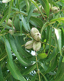
 And did you know the pecan isn’t a nut? It’s a member of the hickory genus and is a drupe, a fruit with a single pit surrounded by a husk.

 there (on stamps), but unexpectedly there is one near me, though without any nesting goats—at least none that I’ve seen.
 Many people, including stamp collectors, find the stamps of the Netherlands a bit too avante-garde, but I’ve always admired how their designers push “the boundaries.” This sheet from 2006 contains five stamps for ordinary mail use within the Netherlands. It would’ve been easier to put multiple copies of the stamp on a sheet side-by-side, and certainly more economical. The Netherlands, however, chose to do more by making a sheet whose title “Beautiful Netherlands” (Mooi Nederland) is composed of perforated letters. And in addition to the playful Eurasian Spoonbill (Platalea leucorodia) with a camera around its neck on each stamp, other images of the wildlife and natural beauty of

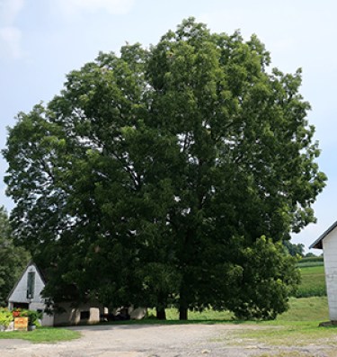
 It’s been almost two months since my last post. With the Corona Virus pandemic necessitating staying at home as much as possible, you’d think I’d be posting more. No excuses.
 For me, being outside is a good antidote to the claustrophobic feelings that so easily take hold these days. Fortunately, across the street from my home are the playing fields for two schools located side-by-side on a large tract of land that was once an “estate.” The trees there always lift my spirits. There are many beautiful mature species. And I’m fascinated by so many differing characteristics.
 My brother occasionally joins me for a walk through these fields, identifing the trees. The one shown here captivated me recently for its sheer grandeur. I wondered what it was. Its leaves looked like those on another tree my brother had identified as a
  the tree in the photograph had leaves in clusters of seven. The Horse Chestnut my brother had pointed out had clusters of five leaves. Researching Horse Chestnut trees I discovered that they come in both clusters of five and seven leaves, so I believe I’ve now identified this tree.
 looks foreboding. However, the inner brown nut is quite beautiful, but I learned that it’s not for consumption.
 some of those stamps are shown here. Monaco issued four stamps, each showing a tree detail in one of the four seasons. I can only conclude that others have found this tree as uplifting as I have. Your thoughts?